
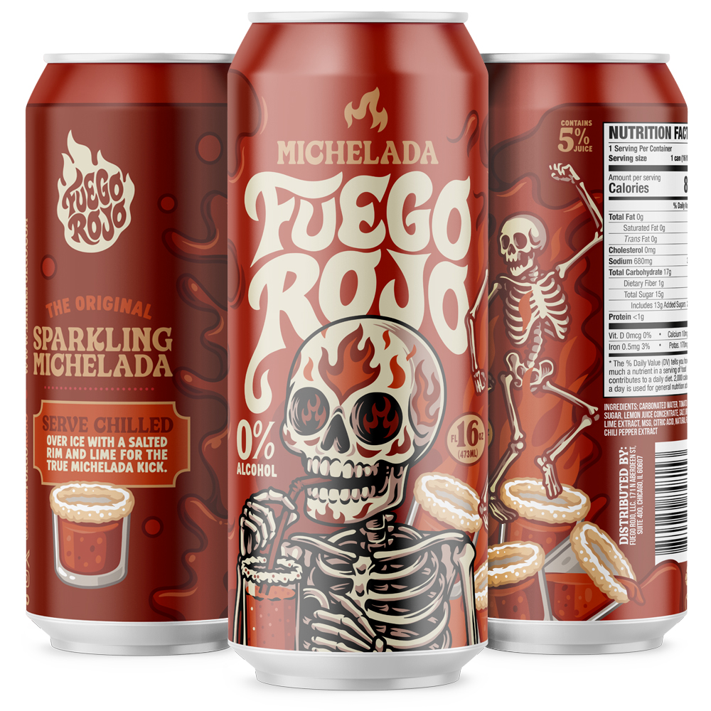
CLIENT: Fuego Rojo
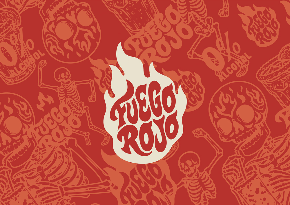
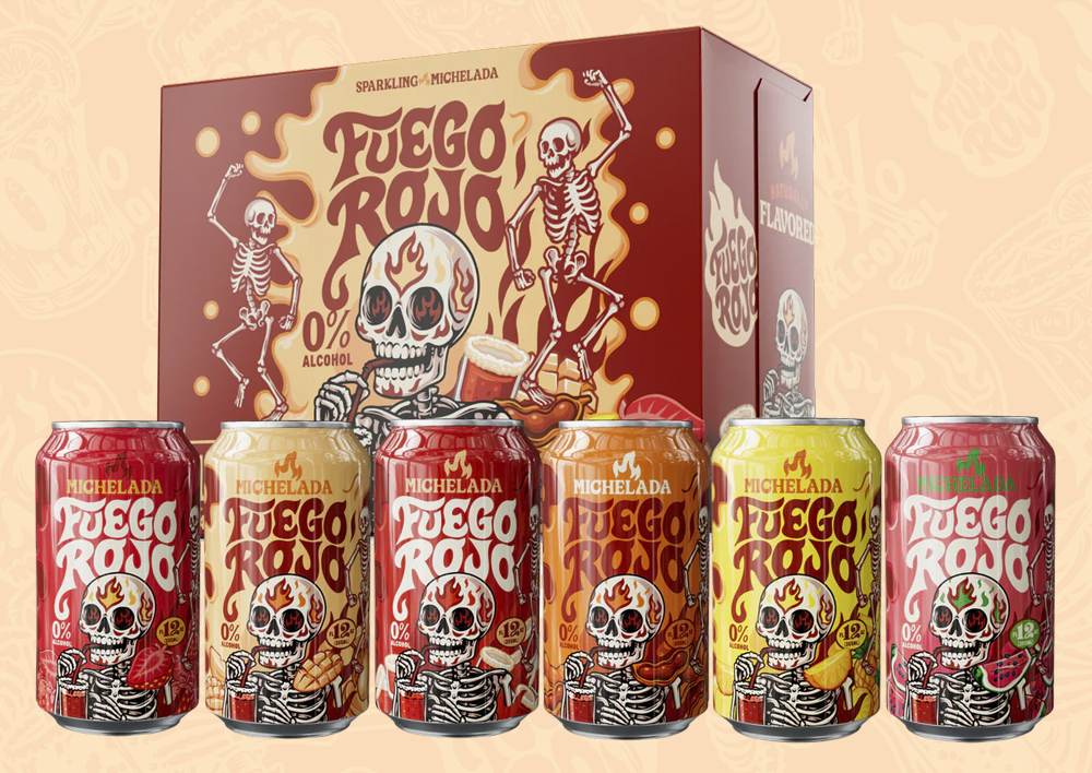
Built around a cast of colourful skeleton characters, this packaging range was created for Fuego Rojo’s alcohol free micheladas. Inspired by Mexican culture and Día de los Muertos artwork, the visual identity combines hand drawn illustration, custom lettering and vibrant can designs to create a bold and memorable presence on shelf.
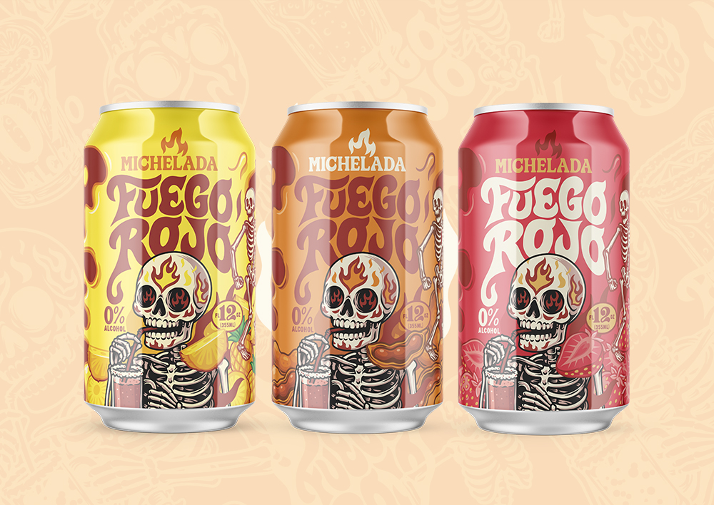
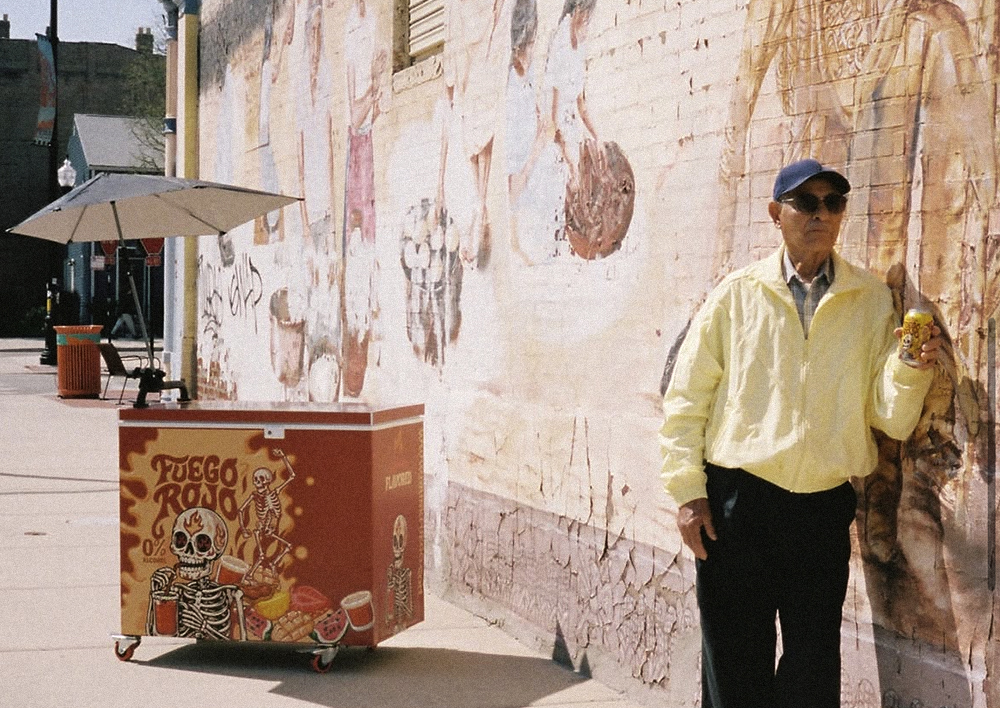
The packaging system was developed to work across multiple flavours while maintaining a consistent and instantly recognisable look throughout the range. Blending character illustration, packaging design and brand storytelling, the final artwork captures the fun, flavour and personality that sit at the heart of the Fuego Rojo brand.