
CLIENT: Rapid Tan
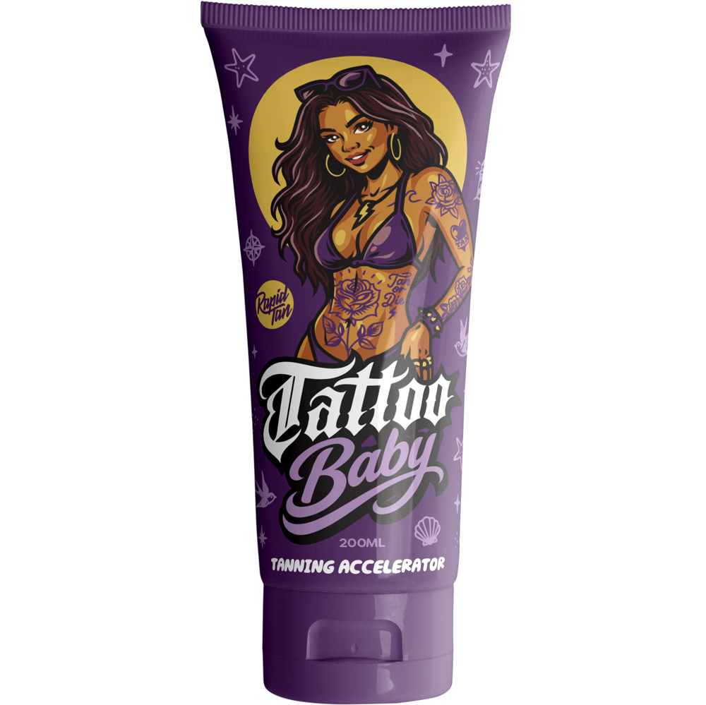
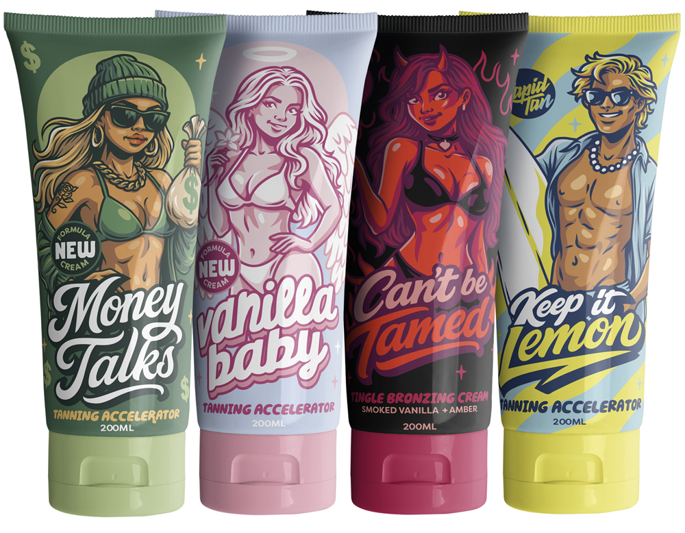
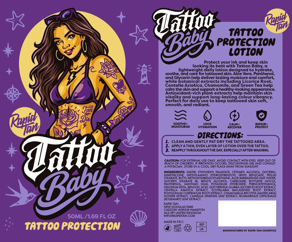
Bold characters, custom lettering and vibrant colour palettes became the foundation of this tanning and skincare packaging range created for Rapid Tan. Developed across multiple products, the artwork was designed to give each SKU its own distinct personality while maintaining a cohesive visual identity throughout the collection.
Combining character illustration, typography and packaging design, the system was built to create strong shelf presence and consistent brand recognition across the range. The final artwork helped establish a memorable product family that could continue to expand while remaining unmistakably Rapid Tan.